In a previous post, we discussed how Moog uses Metal in many of its iOS and macOS apps to render our synth visuals. Here, we will discuss two ways that we render those graphics in our apps: using textures and using shaders.
Textures
In Model 15 and Model D, Moog uses textures to render synth visuals. Textures are images that can be applied to a surface defined by vertices. Each vertex indicates a location on a texture image and the fragment shader takes pixels relative to those vertices from the texture for rendering.
Textures are great at recreating an image of a static object with high detail, so, for Model 15 and Model D, the character of each hardware synth can be brought to the app.
Textures, however, are not optimal when you want an object to animate or have to support a variety of resolutions. For moving controls in Model 15 and D, every knob position needs to be created as an image so it can provide the appropriate lighting and visuals. Additionally, when different size knobs are needed, the textures need to be recreated for that size because most hardware knobs of different sizes are not just scaled down versions of others.
This result is large amount of time spent every time there is a design change or a new device size that needs to be supported.
In Shader
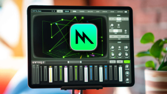
For Animoog Z, we render the controls in the fragment shader itself. Shapes, lines and settings are defined in the buffers that are send to the shaders. Then, the fragment shader goes through the layers to determine what pixel should be rendered for each location.
There are several benefits to rendering in shaders.
- The design of controls can be quickly modified and updated depending on the design of the application.
- It makes it easier to animate controls from frame to frame
- Certain characteristics (line thickness, color palettes, resolution) can be maintained between controls.
One consequence of rendering in shaders is the trade off between complexity and processing resources. Very simple shapes can be rendered more efficiently than textures, while complex shapes with animated visuals and lighting can consume more resources. Finding the correct balance depends on the complexity of the application and the breadth of devices that need to be supported.
Animoog Z Control Example
In Animoog Z, most of the controls are rendered in shaders. Each control is made up of layers of simple shapes that can be broken down into short algorithms that determine whether a fragment is within the bounds of the shape and what color should be returned for the shape.
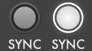
As an example, you can take a look at the Sync button above. When we render controls in the fragment shaders, we start at the top layer and move back through the layers until a color has been selected.
For the inactive button, the top glow layers are disabled in the buffers so they are skipped. After that, the shader looks to see if the fragment is inside of the next layer (the circle with the gradient on it). If inside, then it returns a color determined by the starting base color, the direction of the gradient, and the gradient color.
The same is repeated for the next two layers (the background darker circle) and the brighter ring around it.
If not within these circles, then it moves down to the next layer. While not immediately obvious, there is a shadow to the bottom right that is a black circle with a very soft edge. This helps give some depth to the control. If no color is found, a clear color is sent.
If the button is activated. Then the soft white glow goes over the entire control and that color is returned.
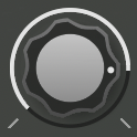
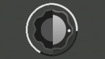
The same process holds true for the knob. Most of the knob is made up of circles and lines, but the knob shape itself is a bit unique. To determine if a pixel is within the knob shape, you calculate the distance from the center to the edge of a sine function with 7 cycles, based on the angle of the pixel from the center. Then, this sine function is cut off at a certain distance to give the characteristic shape of a knob.
r = 0.08 * cos (3.5 * angle + 0.5 * pi) + 0.97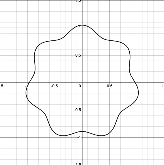
r = min ( 0.08 * cos (3.5 * angle + 0.5 * pi) + 0.97, 1)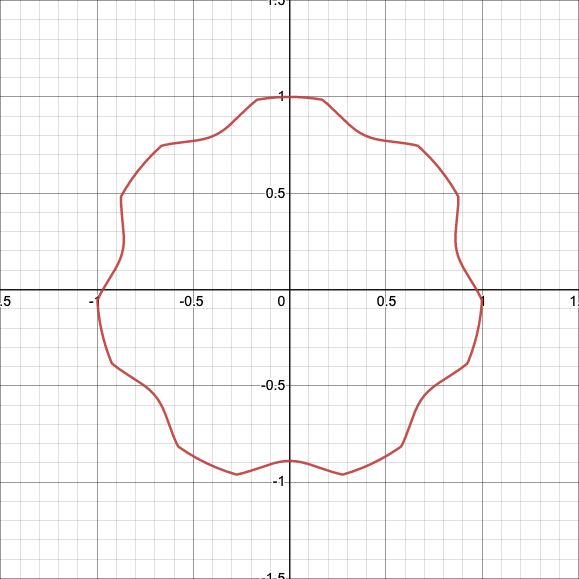
Each of these controls can build off the work of the other and it is very easy to try different sizes, proportions and animations using this approach.
Conclusion
When designing an app, it is important to weigh design decisions with the capabilities of the rendering technology available, and often this results in a combination of rendering techniques. In Animoog Z, textures and shaders are both used to render the app. Rendering with textures is more efficient at rendering static backgrounds and areas with more complex gradients. For highly dynamic controls or the 3D wave table, rendering in shader allows for dynamic animations, flexible design, and precise resolution. How much each rendering technique is used depends the vision for the app and the resources available.


